Revitalizing bpb.de, Enhancing Accessibility and Engagement for Civic Education
Federal Agency for Civic Education
My Role
UX/UI Designer
Team members
Senior UX designer
UI designer
Project Manager
A massive, outdated website hindered users from accessing critical civic education resources.
Project Overview
The Federal Agency for Civic Education (bpb) educates Germany's diverse population on politics and democracy. My team and I worked on a five-year redesign of its 40,000-page website, addressing usability, accessibility, and navigation challenges. The result was a modern, user-friendly platform that balances creative design with functional requirements.
Project impact
As a critical tool for civic education, the bpb website serves millions of users across all age groups and backgrounds in Germany. Its role as a governmental platform demanded flawless usability and accessibility. The redesign transformed the site into an inclusive, seamless experience, ensuring that vital political resources are available to all.
Design Approach
Breaking Down the Challenges
After identifying the core issues through initial research, we divided the problems into actionable work packages. This breakdown enabled us to tackle specific areas systematically. While this case study focuses on the navigation system, we followed similar steps for each challenge.
Information Architecture
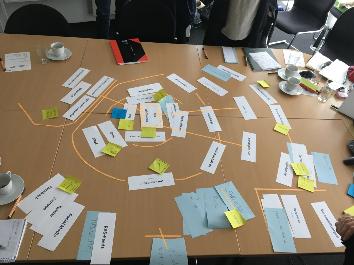
To address the complexity of bpb’s 40,000-page structure, we collaborated with stakeholders to create a comprehensive information map. This process involved organizing content into priority circles, each representing a target group and its corresponding pages.
With the priority framework established, we clustered pages into a navigable sitemap, visualized as a "bpb house." The structure featured a user-friendly "ceiling" for casual visitors and deeper layers catering to specific user groups.
Navigation
The clarity achieved through the information architecture enabled a more efficient navigation system. By keeping the diverse target groups in mind, we developed a two-level navigation concept:
A primary navigation system for broad categories relevant to all users.
Secondary navigation tailored to specific user needs without overwhelming them.
Here is a comparison of the old navigation system to the newly designed concept, which clustered information logically based on user behavior. The new approach offered an intuitive, streamlined experience.
Wireframes
Leveraging the insights from the information architecture and navigation phases, we created over 150 wireframes to address the needs of various user groups. Each wireframe focused on usability and relevance to its target audience.
To ensure the wireframes were effective, we conducted four rounds of testing and iteration. These tests helped us validate the structure and refine concepts before moving into the UI design phase.
UI Design
Designing a platform of this scale required tackling multiple challenges: accessibility, responsiveness, and maintaining a cohesive yet distinctive look for each of the six core sections.
How can we create an accessible, recognizable, and unique design for each section?
We began with a brainstorming process where designers pitched ideas for the overall design language. As the project lead, I compiled these ideas and ran them through user testing to align the visual direction with user needs.
After rounds of refinement, I collaborated with another designer to finalize the UI. The chosen design centered on bpb’s branding while ensuring that each section felt unique yet cohesive.
The responsive design ensured seamless functionality across devices, from desktops (1440px) to mobile phones (320px).
Implementation / Atomic Design
A designer’s role doesn’t end at creating visuals. To ensure a smooth transition to development, I implemented an Atomic Design system.
How can we ensure smooth implementation across 150+ templates?
Working with the front-end team, I broke the design into components: atoms, molecules, organisms, and templates. This modular approach streamlined development and ensured consistency.
Each section of the website had its own file, unified by a central style guide and shared components. This scalable design system allowed for easy updates and maintenance.
Final resultes
Reflections & Learnings
The six-year journey of redesigning bpb.de was both challenging and rewarding. This project taught me invaluable lessons about the intersection of creativity, functionality, and collaboration on a large scale.
Key Takeaways:
Balancing Creativity and Constraints: Designing for a governmental platform with a vast and diverse audience required meticulous attention to user needs and adherence to strict guidelines.
Scaling Design for Impact: The sheer size of this project highlighted the importance of scalable, modular systems like Atomic Design. This approach ensured consistency across thousands of templates.
The Power of Collaboration: Working closely with stakeholders, developers, and designers underscored the value of teamwork in tackling complex challenges.
Iterative Processes Yield Results: Rigorous testing and iterative refinement proved essential in delivering a design that was both functional and user-centric.
This project not only contributed to a more accessible and engaging civic education platform but also elevated my design expertise. I’m proud to have been part of such a meaningful endeavor, collaborating with a talented team to create a lasting impact.


